With the launch of the new PDL website, we thought it was the perfect opportunity to freshen up the identity of the laboratory to highlight its craft and convey the spirit that is behind it. We designed the new identity to be flexible and approachable, while maintaining a simple coherence that is reflected in the new colored version of the Public Data Lab logo.
A flexible approach
The core principle of the new aesthetics of the website is to highlight the uniqueness of projects and endeavours and their call to gather different disciplines, approaches and people to explore specific areas of research.
Each project can be represented with a specific color, that belong to a family of warm and rich color palette that is inspired by historical japanese and western prints. These colors come together in the new logo, that showcases three of them along the new “mango yellow” that ties all the colors in the palette together.
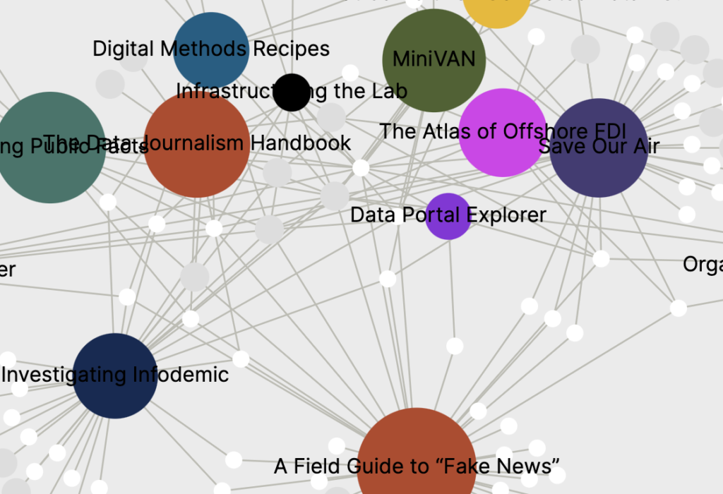
All the projects come together in the network that showcases the interconnections between projects, people and affiliations that make the Public Data Lab. In the network, each project retains its color, making it recognizable also from this bird’s eye view.